Risk and Anomaly Insights Through Visual Dashboards
As DevOps engineers and SREs managing complex, distributed systems, you're no stranger to the challenges of hidden risks and subtle anomalies that can lead to outages, security breaches, or degraded performance. Risk and anomaly insights through visual dashboards…

```htmlRisk and Anomaly Insights Through Visual Dashboards
Risk and Anomaly Insights Through Visual Dashboards
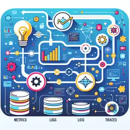
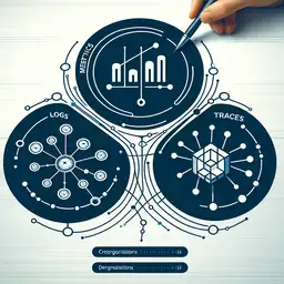
As DevOps engineers and SREs managing complex, distributed systems, you're no stranger to the challenges of hidden risks and subtle anomalies that can lead to outages, security breaches, or degraded performance. Risk and anomaly insights through visual dashboards transform overwhelming raw telemetry data from logs, metrics, and traces into actionable intelligence, enabling proactive mitigation and rapid incident response[1][2].
This technical guide provides step-by-step instructions, code snippets, and real-world examples using Grafana and Prometheus to implement risk and anomaly insights through visual dashboards. You'll learn to spot deployment risks, pod anomalies, and security threats before they escalate, optimizing for tools like Kubernetes clusters and CI/CD pipelines.
Why Risk and Anomaly Insights Through Visual Dashboards Matter for DevOps and SREs
Modern DevOps pipelines in Kubernetes, CI/CD tools, and cloud services generate petabytes of data daily. Without proper visualization, teams drown in noise while missing critical signals like unusual traffic spikes or deployment failures[1][2]. Risk and anomaly insights through visual dashboards address this by highlighting high-risk assets, deviations from baselines, and potential attack paths in real-time[1].
Key benefits include:
- Faster threat identification: Real-time anomaly detection reduces Mean Time to Detect (MTTD) by flagging outliers like latency drifts or error rate spikes[2][3].
- Proactive risk scoring: AI-driven models assign quantitative scores to changes, pull requests, or builds, preventing high-risk deployments[1][6].
- Improved collaboration: Interactive dashboards shared across security, ops, and execs align teams on priorities[1][5].
- Automated alerts: Machine learning overlays detect anomalies beyond static thresholds, integrating with PagerDuty or Slack[2].
For SREs, overlaying DORA metrics (Deployment Frequency, Lead Time for Changes, Change Failure Rate, MTTR) with anomaly bands reveals systemic risks, such as recurring failures in specific microservices[2].
Essential Components of Risk and Anomaly Dashboards
Effective risk and anomaly insights through visual dashboards combine these core elements:
Heat Maps for Risk Prioritization
Heat maps use color gradients (red for high risk, green for low) to prioritize threats across assets, namespaces, or regions. In Kubernetes, visualize pod vulnerabilities by mapping CVSS scores—red indicates outdated images needing immediate patching[1][9].
Time-Series Graphs with Anomaly Detection
Plot metrics like CPU usage, error rates, or latency, then overlay ML-based anomaly bands. Deviations, such as sudden MTTR spikes during deployments, appear as red outliers for instant alerting[2][3].
Incident and Reliability Panels
Track MTTD/MTTR, incident frequency, and tie them to business impacts like revenue loss. Link to traces for root-cause analysis[2].
AI-Powered Insights
Integrate tools like LogicMonitor or Hummingbird AI to auto-detect trends and suggest fixes via natural language queries[1][5].
Practical Example: Building a Grafana Dashboard for Risk and Anomaly Insights
Let's build a Grafana dashboard for a Kubernetes cluster using Prometheus. This delivers risk and anomaly insights through visual dashboards for deployment risks, pod health, and Falco security events[1][3]. Prerequisites: Prometheus scraping kube-state-metrics, node-exporter, and Falco.
- Add Prometheus Datasource: In Grafana, go to Configuration > Data Sources > Add Prometheus (
http://prometheus:9090). - Set Alerts: If anomaly count > 5, notify via Slack.
Gauge for Deployment Risk Score:
avg_over_time(change_risk_score{env="prod"}[1h])Thresholds: >70% triggers ArgoCD webhook block[6].
Time-Series with Anomaly Detection: For error rates:
rate(http_requests_total{status="500"}[5m])Enable Grafana's built-in anomaly detection or use Prometheus' predict_linear for bands:
predict_linear(rate(http_requests_total[5m])[10m:1m], 60 * 5)Anomalies exceed shaded expected ranges[2].
Create Heat Map Panel for Pod Risks:
sum by (namespace, pod) (container_vulns_critical{job="falco"}) / count(kube_pod_info) * 100Set format to Heatmap, color scheme: Red-Yellow-Green.
This setup reduced MTTR by up to 40% in similar environments by surfacing anomalies early[2][3]. Export as JSON for version control.
Advanced Use Cases: AI-Driven Change Risk Prediction
Elevate risk and anomaly insights through visual dashboards with AI. In tools like Digital.ai, score pull requests by historical failures:
- Pre-Deployment Review: Risk >70% blocks via webhook.
- Post-Incident: Correlate anomalies with code changes in a "Failure Factors" panel[6].
- Kubernetes Security: Overlay Falco logs for anomalous access[1][10].
Example PromQL for CI/CD pipeline health:
# Gauge: Build Failure Rate
sum(increase(jenkins_job_builds{result="FAILURE"}[24h])) / sum(increase(jenkins_job_builds[24h])) * 100

# Alert on anomaly
absent_over_time(jenkins_job_success_rate[5m]) > 0
Tools Comparison for Risk and Anomaly Dashboards
| Tool | Key Strength | Best For | Example Use |
|---|---|---|---|
| Grafana/Prometheus[1][3] | Custom ML queries | DevOps pipelines | Deployment risk heat maps |
| LogicMonitor[2] | Anomaly shading | Resource monitoring | Expected range forecasts |
| Splunk/SIEM[2] | Real-time heat maps | Cybersecurity | Asset risk visualization |
| Digital.ai[6] | Change risk scoring | Release orchestration | PR failure prediction |
Best Practices for Implementation
- Start Simple: Focus on one metric like MTTR; validate with stakeholders[1].
- Multi-Source Data: Integrate Prometheus, ELK, Datadog[3].
- Role-Based Views: High-level for execs, detailed for SREs[5].
- Dynamic Thresholds: Use ML; review post-incident[2].
- Interactivity: Add drill-downs, filters, and tags like "Kubernetes anomaly dashboard" for search[1].<